They're blue because computer scientist Ben Schneiderman made them blue using research from 1985:
" In 1985, a group of students at the University of Maryland, mentored by computer science professor Ben Shneiderman , conducted a series of experiments to study the impact of different hyperlink colors on user experience. They were eager to determine which color would be the most effective in terms of visibility and readability.
The experiments revealed interesting findings. While red highlighting made the links more noticeable, it negatively affected users' ability to read and comprehend the surrounding text. On the other hand, blue emerged as the clear winner. It was dark enough to be visible against a white background and light enough to stand out on a black background. Most importantly, it did not interfere with users' retention of the text's context."
Mozille should really do better research before posting histories like this. It's easy to overlook the impact of academic research in tech.
Source:
Barooah, S. (2023, June 09). Why Were Hyperlinks Chosen To Be Blue? Retrieved from https://www.newspointapp.com/english/tech/why-were-hyperlink...
The Mozilla article does reference the Hyperties system Ben Schneiderman worked on, linking to https://www.cs.umd.edu/hcil/hyperties/ with the following comment:
" This may be an ancestor of our blue hyperlink we know and love today, but I do not believe that this is the first instance of the blue hyperlink since this color is cyan, and not dark blue."
She clarified that in her subsequent article. It was the result of Ben Shneiderman's and his students' controlled empirical studies, not whimsy or arbitrary "creative" design (which we suffer from so much these days).
Revisiting why hyperlinks are blue:
https://blog.mozilla.org/en/internet-culture/why-are-hyperli...
Simple.
Red is a warning color, also has bad contrast on white background.
Green on white has bad contrast.
Blue has best contrast on both white and black backgrounds, and stands out from black.
Clear winner.
(Virtually everybody who ever made a PowerPoint presentation figured this out)
Side note: agree with all this except
> Red is a warning color
That is definitely the case in western culture, but in places like China, red is a positive color. Always interesting to learn what are universal signifiers (like up for more) and what are culture-specific signifiers!
Deepseek's iPad app has widgets (buttons labelled "Search" and "DeepThink") that are black in the "off" state and blue to indicate the "on" state.
> Blue has best contrast on both white and black backgrounds, and stands out from black.
Why would it matter if it has good contrast on two different backgrounds? If you're changing the color of the background, you can also change the color of the link.
It’s nice to be able to change between the two most common background colors without needing to develop a whole theme.
In the days before CSS was commonplace, it would also be very annoying to manage.
> They're blue because...
There's no causal evidence in what you posted.
Sure, the experiments determined blue would be a good color.
But I don't see any evidence that the developers of Mosaic were aware of the research or used that to inform their choice.
They were blue when I got there and while we discussed how blue was chosen that is the extent of my recollections of the time - that it was discussed but not the rarionale. They were inspired/informed by the range of colors available in CGA, ANSI and early VGA color palettes. You can’t use a color that doesn’t exist on low end hardware.
It would have made sense for Lynx to settle on blue for ergonomic reasons. ANSI blue is a particular shade thats approximated in hyperlink colors.
This is oddly remeniscent of the Rhine Experiments conducted in 1937, where decks of cards with symbols inscribed were presented to a series of subjects to test extra-sensory perception. What Joseph Banks Rhine found as an abstract was that a statistical deviancy exists for programmatic ideation.
What did the internet look like in 1985? I was under the impression that it'd all be terminal based since the world wide web didn't exist. I'm not sure how a hyperlink would function in such an interface.
Check out HyperCard; it had hyperlinks before the Web.
Related - The Computer Chronicles - Hypercard (1987) https://youtu.be/FquNpWdf9vg
Note that hyperlinks in hypercard weren't blue necessarily, but the mouse cursor did change to indicate it was clickable.
It definitely did -- they weren't in color though.
I'm not sure if HyperCard ever had full color support? There was some support for color images in a later version of HyperCard, but did color text ever make it before it was shut down completely?
> It definitely did -- they weren't in color though.
They were invisible. In HyperCard you could make any region of the screen clickable, and run a script when it was clicked. Not unlike the image maps that websites used to use. You would normally include something visual in the clickable region, but you didn't have to.
I believe the mouse cursor would change if you put it inside a clickable region.
Was HyperCard ever used over the Internet? I thought it was just local decks of cards.
Yes, HyperCard was eventually used over the internet, and it was the first way I know of that enabled people (kids even) to create and publish graphical web pages with a wysiwyg editor, including interactive forms and graphical buttons and links.
https://news.ycombinator.com/item?id=34134403
DonHopkins on Dec 26, 2022 | parent | context | favorite | on: The Psychedelic Inspiration for Hypercard (2018)
Speaking about HyperCard, creating web pages, and publishing live interactive HyperCard stacks on the web, I wrote this about LiveCard:
https://news.ycombinator.com/item?id=22283045
DonHopkins on Feb 9, 2020 | parent | context | favorite | on: HyperCard: What Could Have Been (2002)
Check out this mind-blowing thing called "LiveCard" that somebody made by combining HyperCard with MacHTTP/WebStar (a Mac web server by Chuck Shotton that supported integration with other apps via Apple Events)! It was like implementing interactive graphical CGI scripts with HyperCard, without even programming (but also allowing you to script them in HyperTalk, and publish live HyperCard databases and graphics)!
Normal HyperCard stacks would even work without modification. It was far ahead of its time, and inspired me to integrate WebStar with ScriptX to generate static and dynamic HTML web sites and services!
https://news.ycombinator.com/item?id=21783227
>In fact, one of the earliest tools that enabled anyone, even children, to author and publish their own interactive dynamic web applications with graphics, text, and even forms and persistent databases, was actually based on HyperCard and the MacHTTP/WebStar web server on the Mac:
https://news.ycombinator.com/item?id=16226209
>One of the coolest early applications of server side scripting was integrating HyperCard with MacHTTP/WebStar, such that you could publish live interactive HyperCard stacks on the web! Since it was based on good old HyperCard, it was one of the first scriptable web authoring tools that normal people and even children could actually use!
MacHTTP / WebStar from StarNine by Chuck Shotton, and LiveCard HyperCard stack publisher:
CGI and AppleScript:
http://www.drdobbs.com/web-development/cgi-and-applescript/1...
>Cal discusses the Macintosh as an Internet platform, then describes how you can use the AppleScript language for writing CGI applications that run on Macintosh servers.
https://news.ycombinator.com/item?id=7865263
MacHTTP / WebStar from StarNine by Chuck Shotton! He was also VP of Engineering at Quarterdeck, another pioneering company.
https://web.archive.org/web/20110705053055/http://www.astron...
http://infomotions.com/musings/tricks/manuscript/0800-machtt...
http://tidbits.com/article/6292
>It had an AppleScript / OSA API that let you write handlers for responding to web hits in other languages that supported AppleScript.
I used it to integrate ScriptX with the web:
http://www.art.net/~hopkins/Don/lang/scriptx/scriptx-www.htm...
https://medium.com/@donhopkins/1995-apple-world-wide-develop...
The coolest thing somebody did with WebStar was to integrate it with HyperCard so you could actually publish live INTERACTIVE HyperCard stacks on the web, that you could see as images you could click on to follow links, and followed by html form elements corresponding to the text fields, radio buttons, checkboxes, drop down menus, scrolling lists, etc in the HyperCard stack that you could use in the browser to interactive with live HyperCard pages!
That was the earliest easiest way that non-programmers and even kids could both not just create graphical web pages, but publish live interactive apps on the web!
Using HyperCard as a CGI application
https://web.archive.org/web/20060205023024/http://aaa-protei...
https://web.archive.org/web/20021013161709/http://pfhyper.co...
http://www.drdobbs.com/web-development/cgi-and-applescript/1...
https://web.archive.org/web/19990208235151/http://www.royals...
What was it actually ever used for? Saving kid's lives, for one thing:
>Livecard has exceeded all expectations and allows me to serve a stack 8 years in the making and previously confined to individual hospitals running Apples. A whole Childrens Hospital and University Department of Child Health should now swing in behind me and this product will become core curriculum for our medical course. Your product will save lives starting early 1997. Well done.
- Director, Emergency Medicine, Mater Childrens Hospital
----
Also (a historical note about web browsers with editors, not about HyperCard):
NetScape Gold had a built-in WYSIWYG HTML editor window. But it was a unique selling point -- earlier and other versions of browsers didn't support that. Now browsers have official APIs to support WYSIWYG HTML editing via the "contenteditable" attribute, execCommand function, and Selection class, but you have to implement the menus and toolbars of the user interface yourself, and there are a lot of libraries for that.
https://en.wikipedia.org/wiki/Netscape#Netscape_Navigator_(v...
>Netscape also released a Gold version of Navigator 3.0 that incorporated WYSIWYG editing with drag and drop between web editor and email components.[49]
https://en.wikipedia.org/wiki/Netscape_Composer
https://www.ou.edu/class/webstudy/n4/old/N_GOLD_Editor_Windo...
https://developer.mozilla.org/en-US/docs/Web/HTML/Global_att...
https://html.spec.whatwg.org/multipage/interaction.html#attr...
https://w3c.github.io/editing/docs/execCommand/#execcommand%...
There's a rant that can follow this about usability peaking in the late 90s/early 2000s. Back when companies care about usability research over aesthetics. Buttons looked like buttons yadda yadda.
Blue was by far the easiest on the eye compared to Red, Green, Yellow, Cyan, Purple, on a white background, on old CRT monitors.
The more interesting question is why were backgrounds white rather than black?
To match word processors in looking like paper maybe?
More or less, from what I've read. Once there wasn't a technical issue, a white (or near white) background became seen as more user-friendly than a black background.
Or you could opt for WordPerfect's compromise: white-on-blue.
I'll still use that as an editing background at times.
The industry has cycled back and forth between "dark mode" and "light mode" several times. Browsers first appeared in a "light mode" era, which I suppose probably began with the Lisa then the Mac, then Sun workstations. Black-on-white needed a more expensive high performance CRT and graphics output circuitry so possibly there was an element of chic associated with it vs lowly green/white text terminals that came before.
Yep. I think by the time the web arrived, it was pretty common for the windowing systems (e.g., Windows, Mac System whatever, OpenVue, Next, etc.) to have black text on white backgrounds to mimic paper output.
One thing worth mentioning as a possibly-contributing factor was that in the very early 90s a lot of the installed base of high-res (eg non-interlaced) color monitors where still digital RGB (RGBI) which were limited to 16 colors (and often just 8 colors in two intensities each). In many palettes the 8 base colors were black, white, red, green, blue, cyan, magenta and yellow. So, there weren't a lot of colors to choose from. CRTs had RGB primaries so cyan, magenta and yellow weren't generally as legible for single pixel width lines (ie text).
I also always assumed part of the choice of blue was that in many locales red, yellow and green have connotations of stop/alert, warning and go/okay (respectively) - whereas blue was relatively more agnostic. So... if you're targeting the widest installed base of displays, out of the lowest common denominator choices available blue was pretty much the obvious remaining choice.
So Mosaic did it in 1993.
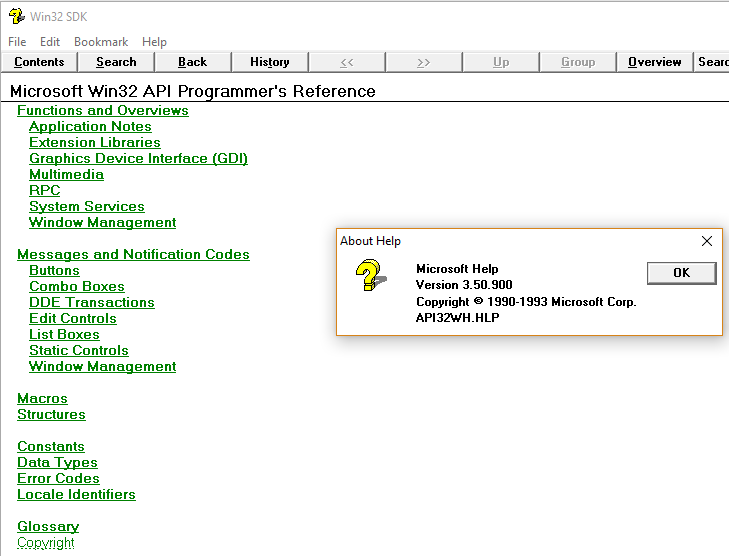
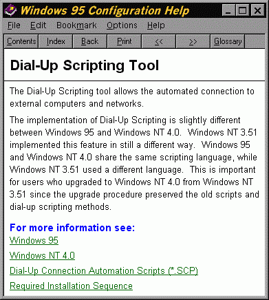
I could have sworn WinHelp [1] (the help viewer built into Windows 3.0) did it in 1990, but looking it up it turns out their hyperlinks were dark green. My memory had changed them to blue retroactively...
A couple of images:
https://virtuallyfun.com/wp-content/uploads/2018/08/WinHelp-...
https://www2.isye.gatech.edu/~mgoetsch/cali/Windows%20Config...
Thanks for posting because I had the same false memory that WinHelp used blue links.
I certainly don't remember feeling that anything about the first browsers or html was new and surprising. It was more like "oh good someone made a free implementation of that obvious idea". There were plenty of documentation systems used industrially that also had links. Gopher existed.
Starting from a white background, what other color can it be?
It has to be a dark color, and blue is the darkest of the primary and secondary colors.
With 16 color displays typical at the time, you can use one of the 8 remaining "half brightness" colors. Dark red is still red, and red tends to mean that something is wrong, which is not the message here. Dark blue and grey do not provide enough of a contrast. Dark yellow and dark green look ugly, they use it in generic cigarette packaging for that reason. Dark cyan could have worked I guess, but that's still a shade of blue, so you might as well just use blue.
Go beyond the VGA standard 16 colors and many computers of the time may not render it correctly.
> Starting from a white background
Possibly an incorrect assumption. As several of the screenshots in the article show, the default background color of the web back then was gray, not white.
What I am fairly sure at the moment, is that they no longer are. People are doing everything possible to NOT make them blue, which something makes them very hard to find
Even more important would be the purple hyperlinks (or any other distinct style) for those links that you've already visited.
I've never liked that feature. You save a page to a PDF and it gets stuck in this permanent mix of blue and purple links.
I've never needed my browser to tell me what I have and haven't visited. Especially since I use different browsers on different devices, so it's never even accurate anyways.
I suspect it’s for the same reason that the two most popular pen colors are black and blue. On light backgrounds, blue shows up well and doesn’t impede readability. So, if all your text is black by default and you want another default color that is also readable, blue’s an obvious choice. Add underlines for users working in grayscale environments.
Related (including alternative answers):
Revisiting why hyperlinks are blue - https://news.ycombinator.com/item?id=29897811 - Jan 2022 (60 comments)
Why are hyperlinks blue? - https://news.ycombinator.com/item?id=28315934 - Aug 2021 (255 comments)
I’m pretty sure that Gopher was only “Green on Black” because many of the terminals used to display them (ie. DEC’s VT220) used green phosphors.
If you had a white phosphor terminal, it would have been White on Black.
a weak clickbait-y post from 2021 that didn't even really answer its own question etc.
Discussion: https://news.ycombinator.com/item?id=28315934
Quite amusing once you know the real answer.
I (or a commenter who goes by the same name) contacted the author Elise Blanchard and introduced her to Ben Shneiderman, and gave her some links to our work on HyperTIES. She wrote a followup article with more detailed information.
Revisiting why hyperlinks are blue:
https://blog.mozilla.org/en/internet-culture/why-are-hyperli...
It wasn't just a random or intuitive choice, but the results of many empirical studies and experiments (which is Ben's whole "thing", and unfortunately extremely rare these days):
>“We conducted approximately 20 empirical studies of many design variables which were reported at the Hypertext 1987 conference and in array of journals and books. Issues such as the use of light blue highlighting as the default color for links, the inclusion of a history stack, easy access to a BACK button, article length, and global string search were all studied empirically.”
Hypertext on Hypertext CACM1988 - Ben demonstrating HyperTIES with blue hyperlinks, the system that influenced Tim:
https://www.youtube.com/watch?v=29b4O2xxeqg
Here is my post to the hn discussion of her first article, included an email Ben wrote to me a year before the article, full of citations and links to papers and web pages about it:
https://news.ycombinator.com/item?id=29921532
>Ben Shneiderman recalled that "Tim told me at the time that he was influenced by our design as he saw it in the Hypertext on Hypertext project".
>Ben Shneiderman wrote the following email to John Gilmore and I, in response to a question John asked me about the origin of the term "hyperlink" raised in a discussion on the Internet History mailing list. John then forwarded Ben's email to the Internet History mailing list.
https://elists.isoc.org/pipermail/internet-history/2020-Apri...
----
From: Ben Shneiderman <ben at cs.umd.edu> To: Don Hopkins <don at donhopkins.com> CC: John Gilmore <gnu at toad.com>, Ben Shneiderman <ben at cs.umd.edu> Subject: RE: [ih] origins of the term "hyperlink" X-ASG-Orig-Subj: RE: [ih] origins of the term "hyperlink" Date: Mon, 13 Apr 2020 15:15:52 +0000
HI Don (and Jack Gilmore),
Thanks for including me in this conversation.
I do not have a claim for the term “hyperlinks” and don’t know when it came into use. My claim is for the visual interface for showing highlighted selectable links embedded in paragraphs. This is what we called embedded menu items in that I think is an influential paper on the topic, which was peer-reviewed and published in the CACM in April 1986.
https://dl.acm.org/doi/10.1145/5684.5687
http://www.cs.umd.edu/~ben/papers/Koved1986Embedded.pdf
While Engelbart had shown a list that could be selected by pointing and clicking in 1968, I claim the idea of embedded highlighted selectable text in paragraphs. This was implemented by grad student Daniel Ostroff and described in:
Ewing J, Mehrabanzad S, Sheck S, Ostroff D and Shneiderman B (1986), "An experimental comparison of a mouse and arrow-jump keys for an interactive encyclopedia", International Journal of Man-Machine Studies, Jan., 1986, Vol 24, pp. 29-45.
[Abstract] [BibTeX] [DOI]
Ostroff D and Shneiderman B (1988), "Selection devices for users of an electronic encyclopedia: an empirical comparison of four possibilities", Information Processing and Management, Nov., 1988, Vol 24(6), pp. 665-680.
[Abstract] [BibTeX] [DOI]
I think the 1988 paper was the earlier study, but the publication took a while.
My students conducted more than a dozen experiments (unpublished) on different ways of highlighting and selection using current screens, e.g. green screens only permitted, bold, underscore, blinking, and I think italic(???). When we had a color screen we tried different color highlighted links. While red made the links easier to spot, user comprehension and recollection of the content declined. We chose the light blue, which Tim adopted.
His systems with embedded menus (or hot spots), where a significant user interface improvement over early systems such as Gopher. But Tim told me at the time that he was influenced by our design as he saw it in the Hypertext on Hypertext project that we used Hyperties to build for the July 1988 CACM that held the articles from the July 1987 Hypertext conference at the University of North Carolina. The ACM sold 4000 copies of our Hypertext on Hypertext disks.
Our history is here:
https://www.cs.umd.edu/hcil/hyperties/
and the video is very helpful in showing the design we used, which is what I think Tim built on for his WWW prototypes.
https://www.youtube.com/watch?v=29b4O2xxeqg
So in summary, I don’t know who coined hypertext, but I do think our work visual and interaction design was influential.
Our Hyperties system was picked up by Cognetics Corporation (around 1987) who made a modestly successful commercial run with it, doing dozens of corporate projects, most notably the Hewlett-Packard user manual for their Laserjet 4 was distributed as a Hyperties disk.
Hyperties was the name we shifted to after we got a stop and desist order from a lawyer because our TIES (The Interactive Encyclopedia System) conflicted with an existing product. By then “hyper” was a growing term.
Let me know if this helps, and what other questions you have…. Ben
----
Here's more information about our work on HyperTIES and other stuff like pie menus and tabbed windows at the University of Maryland Human Computer Interaction Lab:
HyperTIES Discussions from Hacker News
https://donhopkins.medium.com/hyperties-discussions-from-hac...
Designing to Facilitate Browsing: A Look Back at the Hyperties Workstation Browser By Ben Shneiderman, Catherine Plaisant, Rodrigo Botafogo, Don Hopkins, William Weiland. Published in Hypermedia, vol. 3, 2 (1991)101–117.
https://donhopkins.medium.com/designing-to-facilitate-browsi...
I actually asked Marc Andreessen this question a few years ago while making a browser.
Me: “why did you decide to make links blue?”
Marc: “I sure as hell wasn’t going to make them pink.”
Me: “what about green?”
Marc: “ew”
Can’t fault his logic.
Here is some email between Ben Shneiderman and Mark Andreessen about it that I posted to the Internet History mailing list archive with their permission:
https://elists.isoc.org/pipermail/internet-history/2020-Apri...
And a couple of relevant papers:
Embedded menus: Selecting Items in Context; Larry Koved and Ben Shneiderman; Communications of the ACM, Computing Practices, April 1986, Volume 29, Number 4, p. 312-318:
https://donhopkins.com/home/documents/Koved-Embedded%20Menue...
An experimental comparison of a mouse and arrow-jump keys for an interactive encyclopedia; John Ewing, Simin Mehrabanzad, Scott Sheck, Dan Ostroff and Ben Shneiderman; International Journal of Man Machine Studies (1986) 24, p. 29-45:
https://donhopkins.com/home/documents/Ewing-Ostroff-mouse-ar...
Intuitively it makes a lot of sense. Red is obviously associated with “bad/stop/destructive” and green with “positive/go” while blue is neutral in this respect. The other colors aren’t primary and they have their own problems: orange is too similar to red and yellow is too hard to make out against a white background. Purple is okay which is why it’s used for “visited” links but it’s much less ubiquitous than blue in everyday life which makes it gaudy/distinctive.
They’re blue because Marc Andreesen liked blue.
https://www.instagram.com/reel/DPO0A7dDvFm/?igsh=NTc4MTIwNjQ...
… according to Marc Andreesen
There is a video of marc andreesen going around where that question given to him: https://x.com/mrexits/status/1956237638878552418
Microsoft's EDIT, QBASIC, QuickBASIC and MSDOS 6.x had on-screen help in the form of hypertext documents with white links inside green brackets on a black background. It looked good. Windows 3.1x also had on-screen help in the form of hypertext documents with underlined green links on a white background. It also looked good. They cherry-picked their examples by talking about Windows 3.1 without mentioning that. First time I experienced the world wide web, it was using NCSA Mosaic and it featured blue hyperlinks instead of green, which was a surprise.
So did Marc Andreessen take undeserved credit or not? That's what I want to know...
Yes, or maybe he didn't know or remember what influenced Tim Berners Lee to make them blue, so he just took credit for himself decades later, so yes.
Ben Shneiderman and his students originally performed experiments that determined that blue was the best color, then Ben developed and ACM distributed HyperTIES with blue links as "Hypertext on Hypertext", which Tim saw, and years later Tim told Ben that it influenced him to make the links blue.
Here is some email between Ben Shneiderman and Mark Andreessen about it that I posted to the Internet History mailing list archive with their permission:
https://elists.isoc.org/pipermail/internet-history/2020-Apri...
Hypertext on Hypertext CACM1988 - Ben demonstrating HyperTIES with blue hyperlinks, the system that influenced Tim:
https://www.youtube.com/watch?v=29b4O2xxeqg
And a couple of relevant papers:
Embedded menus: Selecting Items in Context; Larry Koved and Ben Shneiderman; Communications of the ACM, Computing Practices, April 1986, Volume 29, Number 4, p. 312-318:
https://donhopkins.com/home/documents/Koved-Embedded%20Menue...
An experimental comparison of a mouse and arrow-jump keys for an interactive encyclopedia; John Ewing, Simin Mehrabanzad, Scott Sheck, Dan Ostroff and Ben Shneiderman; International Journal of Man Machine Studies (1986) 24, p. 29-45:
https://donhopkins.com/home/documents/Ewing-Ostroff-mouse-ar...
They’re blue because pmarca was a democrat back then
As a red-green colorblind person, curse the person who decided visited links should be purple.
You can override this in most browsers. (And for those where you can't, there's always userstyles.)
That's like reading about evolution of internet browsers. I witnessed the stuff since around 1991. I suspect the W3C and other standards bodies such as IETF might also have had some role in the matters of rendering the HTML markup. Ofcourse Mozilla was also a dominant player in shaping things up in this space.